The biggest problem the bulls have right now is the look of this chart…

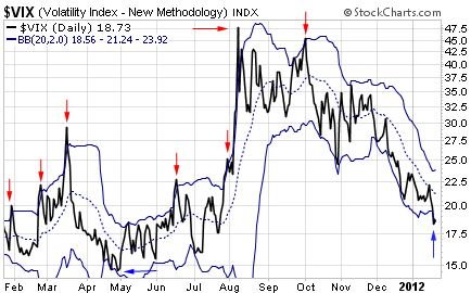
This is an updated chart of the Volatility Index (or “VIX”) that I showed you last week… Only this time, it’s plotted along with its Bollinger Bands. Bollinger Bands help define the most probable trading range for a security. Any move outside the Bands indicates an extreme condition – one that is likely to reverse direction.
[ad#Google Adsense 336×280-IA]The red arrows in the chart above show each time within the past year the VIX popped above its upper Bollinger Band. This indicates an extreme upside move that has always led to a reversal and contraction in volatility.
The blue arrows point to each time the VIX closed below its lower Bollinger Band. This is an extreme downside move that usually leads to a reversal and expansion in volatility.
Notice where the VIX closed on Friday? It’s below its lower Bollinger Band. This is just another reason to expect an increase in volatility – soon.
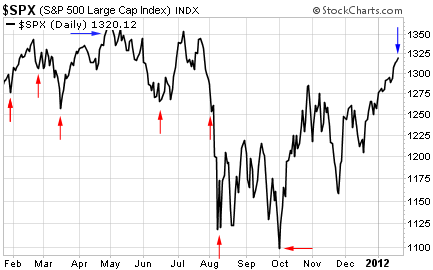
Here’s how the S&P 500 traded following each of those VIX signals…

Most of the sell signals (red arrows) on the VIX accompanied a tradable bottom on the S&P 500. The two obvious exceptions were the signal in late February – which led to only a small bounce in stocks before they headed lower again – and the signal in late July – which preceded a stock market cliff dive.
The buy signal (blue arrow) on the VIX happened right before the stock market peaked last May.
So as you can see, the VIX has a good track record of signaling important turns in the stock market. Traders have to be on guard for a change in trend any time the VIX closes outside of its Bollinger Bands, like it did last Friday.
If history is our guide, volatility is now set to expand. Get ready for some downside pressure on stock prices.
Best regards and good trading,
Jeff Clark
[ad#jack p.s.]
Source: The Growth Stock Wire

