
After taking a nine-month break, the bull market in stocks is back.
Yes… I know. That’s old news. The benchmark S&P 500 Index bottomed in February, after all. And it hit a new all-time high in July.
So what’s new?
[ad#Google Adsense 336×280-IA]Well… Lots of folks are still on edge. According to the latest survey by the American Association of Individual Investors (AAII), the number of bullish (optimistic) investors is 38% lower than average… and the number of bearish (pessimistic) investors is 22% higher than average.
That’s not surprising.
Investors are often bullish and bearish at the wrong times. And based on history, it’s time to be more bullish than usual… not bearish…
You see, the S&P 500 recently reached a major milestone. We’ve just surpassed four straight months of an uptrend in the index’s 200-day moving average (DMA)…
Regular readers know that a lot of professionals like to use the 200-DMA to size up a market’s long-term trend. It works by collecting an asset’s closing prices from the past 200 days, then taking the average of those prices. This produces a chart line that “smoothes out” market volatility.
There are two main things to consider when looking at the 200-DMA.
The first is that during bull markets, stocks tend to spend most of their time above the 200-DMA. During bear markets, they spend most of their time below it.
The second is the direction of the 200-DMA itself. Whether it’s moving higher or lower, stocks often continue to move in the same direction. So when the 200-DMA is in a strong uptrend, it’s a great sign for the market.
As I noted, we recently surpassed four straight months of an uptrend in the S&P 500. Over that period, the index’s 200-DMA has moved higher each day.
So I asked a simple question: What has happened after similar conditions in the past? Specifically, what happened when the 200-DMA launched into a four-month uptrend after a period of no clear trend or a downtrend?
As it turns out, before this most recent occurrence, this had only happened 18 other times in the past 80 years. The results are bullish. But before I get to the numbers, let’s look at a chart that shows the six most recent “triggers”…
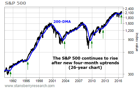
As you can see, these were good times to buy stocks…
Looking forward one, two, three, six, and 12 months from the trigger dates, the average and median returns were all greater than the returns for all periods. In most cases, they were far greater.
(If you’re not interested in the data, feel free to skip down to below the last table.)
The first table below shows the S&P 500’s average and median returns for all periods over the past 80 years. The second table shows the returns only after a new period of four straight months with a rising 200-DMA…

It wasn’t just the returns that were greater. The drawdowns were smaller, too. You may know that a drawdown is the most an asset drops during a given time frame, even if it recovers before the end of that period. Again, the first table below shows average and median drawdowns for all periods over 80 years. The second shows drawdowns only after the triggers.

That’s a lot of information. But one more table really drives the idea home.
Take a quick look at the one-year drawdowns and returns for each of the 18 triggers. You’ll see that the worst one-year drawdown (the biggest drop from the trigger date) was just 12.9%. The worst one-year return (if you held on for a full year after the trigger) was 1.3%.

In other words, every single trigger led to higher stock prices one year later. If you bought a fund that tracks the S&P 500, then sold on the worst possible day within one year following the worst trigger (in 1971), you would have only lost 12.9%.
History doesn’t guarantee anything for the coming year. But if you’re still avoiding stocks, at the very least, it’s time to test the waters. In the past, a strong new uptrend usually led to smaller drops and bigger gains. It may well mean the same this time.
Good trading,
Ben Morris
[ad#stansberry-ps]
Source: Growth Stock Wire
