Since everyone is getting all bulled up after Tuesday’s Golden Cross, and with investor sentiment numbers showing bears have gone into hibernation, it’s time to throw another bucket of ice-water onto the bullish fire. Take a look at this chart…
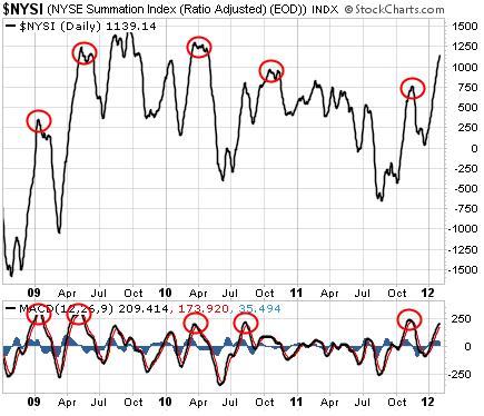
 [ad#Google Adsense 336×280-IA]This is a chart of the New York Stock Exchange Summation Index (NYSI). It’s an intermediate-term measure of overbought and oversold conditions.
The red circles on the chart indicate times when the NYSI was overbought and when the MACD momentum indicator (the bottom box) extended beyond the 200 level… then turned lower. (That’s a bearish signal and often precedes a stock market correction.)
The last time we looked at this chart was back in November. We had similar circumstances then. The stock market had rallied nearly straight up the entire month of October. It seemed as though everyone had turned bullish. And buyers seemed to buy on any sign of weakness.
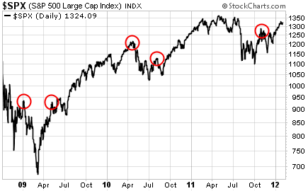
But the market turned lower anyway – just as it has after every NYSI sell signal of the past three years. The circles on the following S&P 500 chart correspond with the NYSI sell signals…

In all cases, the S&P 500 suffered at least a modest pullback. Sometimes, the correction was far worse than “modest.”
It is easy to be bullish right now. Price action is good. Momentum is strong. Just about everyone is expecting higher stock prices. Heck, even I think the market will end 2012 with a double-digit gain.
But based on this sell signal from the NYSI, the next few weeks could be a challenge. There’s no reason to rush in and buy stocks here just because have a Golden Cross. We also have plenty of overbought technical conditions. If you’re anxious to buy, you may be better off waiting for a bit of a pullback first.
Best regards and good trading,
Jeff Clark
[ad#jack p.s.]
Source: The Growth Stock Wire


