Last week, I wrote an essay called, “Housing Is Up Big… And It’s Still a Great Deal.”
I showed how house prices aren’t much different today than they’ve been over the long run – when you adjust for inflation and square footage (houses have gotten bigger).
I got an intelligent note – from a flustered subscriber – saying that I’ve got it all wrong.
“You paint a very rosy picture comparing today’s home prices to 45 years ago,” the subscriber says…
What you’re missing terribly is that incomes have not risen to keep pace with inflation since the 1980s. Had wages kept pace with that inflation, homes would still be affordable, as you say. But they haven’t.
He says my article “ignores the bigger picture. Housing is in a bubble. Just like the stock market.”
What do you think? Do you think housing is in a bubble?
This subscriber raises some good points.
But if you believe housing is in a bubble, make sure you’re considering all the right factors…
The subscriber is mostly right about U.S. household incomes.
The median household income in the U.S. in 2013 was roughly what it was in 1978 – about $54,000 – when you adjust for inflation.
Take a look…

So the subscriber is right that household incomes haven’t gone up a whole lot.
But he is wrong about affordability.
This idea is important…
People make a home-buying decision based on the monthly payment – not the house price. They ask, “Can I afford this monthly payment relative to my income?”
So we can come up with a rough measure of housing affordability in America… We just need a couple of inputs:
- The median monthly payment (which we can determine based on the median house price and the current mortgage rate).
- The median household income.
From there, we have to make a couple of assumptions… We assume 25% of income goes toward the mortgage, and we assume a 20% down payment. (I realize these numbers have fluctuated over time. We could have assumed 10% down payment, for example. If we did, however, the result would look the same – just shifted.)
When you compare the median income to the monthly payment on the median home, this is the picture that emerges:
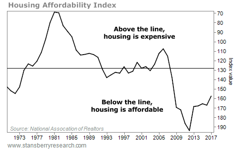
This is a big deal…
Your mortgage rate is a huge factor in your monthly house payment. This chart shows just how punishing mortgage rates were back in the early 1980s. They were in the high teens… And as a result, houses were incredibly unaffordable back then.
The chart also shows just how extreme the housing bust was into 2011… and how affordable houses were after that, relative to history.
2011 was the buying opportunity of our lifetimes.
Today – thanks to low mortgage rates – housing is still affordable in my book. The median monthly payment relative to the median income is still attractive.
Yes, house prices have soared a lot since 2011. That’s a fact.
However, nearly everyone I know wants to draw conclusions… They want to change “up a lot” to mean “expensive” or “in a bubble.”
That’s how everyone thinks. But in my decades of studying and writing about the markets, one of the biggest lessons I’ve learned is that “up a lot” does not mean “it’s expensive” or “it’s a bubble.”
I realize I am not going to change this subscriber’s mind. But I wanted to share his opinion with you. And I wanted you to see how I think about it.
House prices are up a lot – yes. But houses are not overpriced yet… far from it.
Good investing,
Steve
The legendary stockpicker who built one of Wall Street's most popular buying indicators just announced the #1 stock to buy for 2026. His last recommendations shot up 100% and 160%. Now for a limited time, he's sharing this new recommendation live on-camera, completely free of charge. It's not NVDA, AMZN, TSLA, or any stock you'd likely recognize. Click here for the name and ticker.
Source: Daily Wealth