
This week, my colleague Brett Eversole sold his house here in Florida after just a couple days on the market…
He’d barely gotten the “For Sale” sign in the yard before he had multiple offers – including a CASH offer AT ASKING PRICE.
The asking price was 29% more than he paid for it in 2013. He took the deal.
You might wonder, is this example a good representation of the coastal Florida housing market today?
The short answer is “yes.”
But don’t let this lead you to the wrong conclusions…
The housing market is up a lot – that’s true. But it’s not expensive yet. Let me show you why…
In the early 1970s, a typical new house in America was about 1,500 square feet. Today, a new house in America is about 2,500 square feet – 1,000 square feet larger than houses were 45 years ago.
When you take this into account, you learn that house prices today – per square foot – are actually about the same as they’ve typically been over the last 45 years.
Let’s get into the specifics…
The median existing home price in America today is about $250,000. Meanwhile, the median size of a new home in America is roughly 2,500 square feet. So that math is easy – that’s roughly $100 per square foot for the median house.
Forty-five years ago, the math is nearly identical (when you adjust for inflation). The median house size was just over 1,500 square feet. And the inflation-adjusted price of a home in the early 1970s was just over $150,000.
Here’s what this measure looks like over the past 45 years:
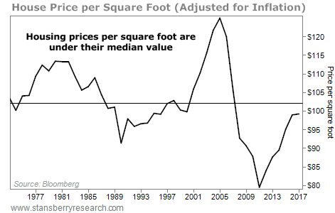
I find this chart fascinating, for two reasons…
- You can clearly see how extreme the housing bubble was in 2006.
- Just as impressive, you can see how extreme the housing bust was by the end of 2011.
There’s a good chance that – for the rest of my life – I’ll never see a buying opportunity in housing as good as it was in 2011-2012. (Hopefully, you took my advice back then and loaded up on property!)
This chart also tells us something else…
Sure, house prices in America have run up – a lot – from the bottom. Even based on price per square foot, house prices are up nearly 25% from their lows in 2011. However, even after that run up, this measure is still below its long-term average.
But this chart DOESN’T show one important thing…
Houses are more affordable today than just about any time in that chart.
Consider the difference in 30-year mortgage rates today, compared with 1981:

No big deal, right? It’s a different interest rate… so what.
It is a big deal. 1981 was the peak in mortgage rates. If rates were at 18.5% today, we’d be in trouble…
On a $250,000 loan at 4.4% interest, you would pay about $1,250 a month for 30 years. Over the life of the loan, you would pay about $200,000 in interest.
On the same $250,000 at 18.5% interest, you would pay about $3,870 a month for 30 years. Over the life of the loan, you would pay $1.1 million in interest.
What’s hard to imagine is that my parents actually would have paid those types of interest rates back then!
I have two points for you today…
First: Sure, house prices have gone up since 2011. But houses today are not that expensive yet… Prices are actually just around their 45-year median, based on the chart above.
Second: When you factor in interest rates, it’s easy to see how much cheaper a house is today than it was in 1981, for example.
U.S. housing is not expensive, relative to history. In my opinion, we still have plenty of upside left.
I’ve put my money where my mouth is on this one… Florida real estate near the coast is still the biggest part of my own financial net worth (not including my home).
Yes, my friend, the housing market is hot. But no, it’s not time to worry at all.
Good investing,
Steve
I recently visited Mar-a-Lago... And now I'm prepared to put my reputation on the line. Since 1998, my proprietary system would've returned 13,126% in backtests. (That's 13X the S&P and 106X the average investor, according to JP Morgan.) However, one investment I just uncovered could be my biggest winner of all... It involves President Trump, Elon Musk, trillions of dollars, China... And a MAJOR upgrade to the artificial intelligence revolution. See for yourself!
Source: Daily Wealth
